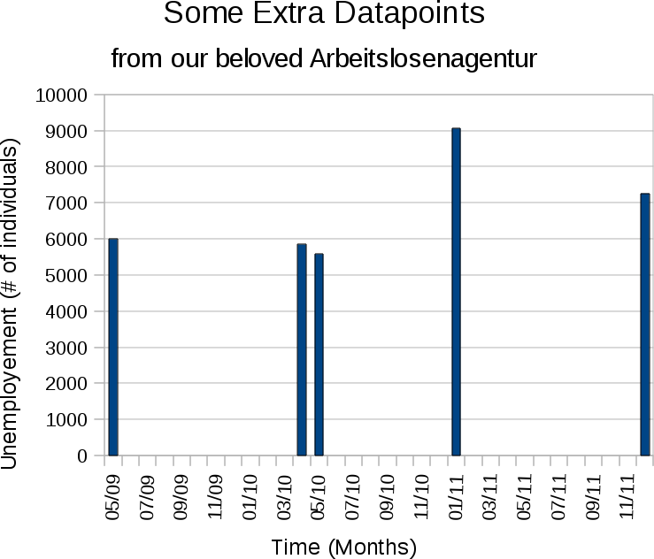
- Time seems to run backward. In any sensible graph time goes from left to right. The past is put left, the future is put right. However, in Lörrach time seems to run backward. We start with May 2010 and go to May 2009.
- Non visualized gap. Aside from the fact that time goes backward the horizontal axis also doesn't show that there is no data between may 2009 and april 2010. In a normal graph such gap in the data is visualized with lightnings, breaklines, or just a big fat white space. None of this can be found in this graph.
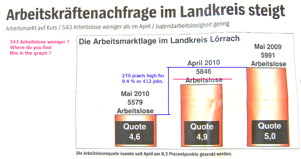
- Inconsistency between header and
graph. The headers state: '543 less unemploed between april and
may'. I simply don't see this in the number. I find 267.
- Y-axis missing. Doesn't the orange bars seem out of proportion ? I mean: 4.6 left, 4.9 to the right, however, in visual height the thing is half the size of the second. The problem is that there is no Y-axis. Clearly Y start at around 5000, not at 0, as any common person would expect.
- % reports too inaccurate. The middle bar should plateau at the red line, not where it does now. The reasoning: we need 270 pixels for 0.4%, which means that if we then go from the 4.6% plateau to 4.9% we should raise around 202 pixels. Of course, if you think further about this; the graph is corerct if we look at the numbers 5579, 5846 and 5991 instead. However, that poses some other interesting problems later on.
- Are the percentages correct ?
From the numbers and percentages we tried to figure out how many people
live in Lörrach: Based on the fact that 5.0% of the total
population is 5991, we can conclude that the total number of people is
between 121030 and 118657. For May 2010, we know that the actual total
must be between 119978 and 122615 and for April 2010 we know that the
total must fall between 118101 and 120536, bracketing the total number
to a value between 119978 and 120536. Now that we know this we can also
conclude that the decrease from 5846 (april 2010) to 5579 (may 2010),
which is 267 people, must be a decrease of 0.2% (0.22 to be correct)
and not 0.3% as stated in the figure caption.
- Ambiguous choice of numbers.
Of
course, an explanation here might be that the number of people
living in Lörrach was not stable throughout the year, in which
case
the question is: which number _are_ correct ? Either we trust the
absolute
number of unemployed, which means nothing without knowing the total
number of people living in Lörrach at that time; or we trust the
percentages,
in which case the graph should also present the percentages and not the
absolute number. As it currently stand, the graph is incomplete and/or
inconsistent.
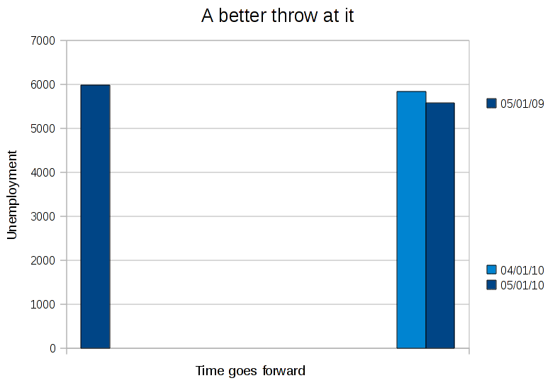
Essentially, this is a hopeless graph,
but a nice demonstration why they should prohibit incompetent fools and
secretaries from making graphs. If this was made by a professional
consultant: fire him/her. Below is the graph as I would have reported
it.
One of the things that become clear in this graph is that the question is not as much what the decrease is compared to last year or last month, but also what actually happenede between may last year and april this year. Suppose that the unemployement oscilated wildly and that this is a general trend each year, then it might make the meaning of these number even less important than they already seem.
One of the things that become clear in this graph is that the question is not as much what the decrease is compared to last year or last month, but also what actually happenede between may last year and april this year. Suppose that the unemployement oscilated wildly and that this is a general trend each year, then it might make the meaning of these number even less important than they already seem.