| Home | Papers | Reports | Projects | Code Fragments | Dissertations | Presentations | Posters | Proposals | Lectures given | Course notes |
|
|
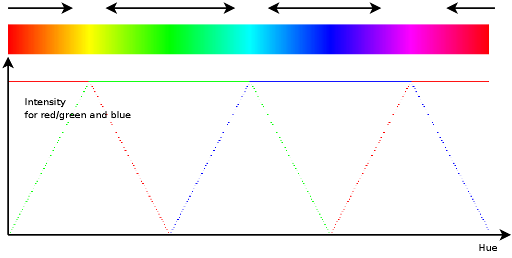
How to Improve the Presence of Secondary Colors in Huebars used for Heat Diagrams ?Werner Van Belle1* - werner@yellowcouch.org, werner.van.belle@gmail.com Abstract : When working with hue-bars or heat diagrams one relies on the fact that these colors are perceived linearly and thus properly represent the underlying data. This assumption is often wrong because the secondary colors yellow and turquoise tend to use less space than the primary colors red, green and blue. In this document we design a huebar which is perceived linearly, or stated differently in which each of the colors is equally abundant: red, yellow, green, turquoise, blue, purple and red.
Keywords:
color perception display devices hue bars huebars heat diagrams data visualisation linear |
1 Introduction
|
To represent medical or bioinformatics data one often relies on images to communicate some information. As many researchers have realized: our eye is not particularly well suited to recognize differences in intensities. E.g: is this 'more' gray or 'less' gray is difficult to distinguish and different color shades are interpreted as chunks of information. Segmented so to speak. A second reason why intensity-only representation of data is less than optimal is that it prints badly. One can never be sure whether the printer can actually represent the subtle differences.
As such it makes sense to rely on our optical ability to distinguish colors easier. To this end we find that a hue bar is often used (Figure 1). The problem with such huebars is that most implementations do not offer a linear range of colors. There will be areas of the huebar that will change rather quickly, while other areas need more change to be perceived as a change. In particular, the colors red, green and blue have substantially larger coverage than the secondary colors: yellow, turquoise and purple. Because in one of our experiments this has lead to a misinterpretation of the data we feel it time to study this in some more detail and try to resolve it.
2 Gamma Correction Matters
|
To study and solve this problem, we relied on a different approaches.
The first one relied on the creation of a mathematical model off how
we perceive color. That route however was problematic since such models
do not only cover our perception they inevitably also need to include
how the display device renders a red-green-blue tuple into a color.
This revealed an unexpected aspect of huebars, which is that the gamma
correction does matter with respect to the perception of colors. Figure
2 is a simulation on the standard
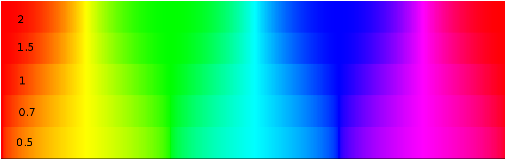
huebar with positive and negative log(![]() ) values. We tried
to use different gamma corrections to widen the different secondary
colors but found no good solution to this problem because there were
always specific band that became more narrow. With a positive gamma
correction (
) values. We tried
to use different gamma corrections to widen the different secondary
colors but found no good solution to this problem because there were
always specific band that became more narrow. With a positive gamma
correction (![]() ) we find that the area allocated to the secondary
colors is smaller. And for negative gamma corrections (
) we find that the area allocated to the secondary
colors is smaller. And for negative gamma corrections (![]() )
we find that those areas become larger at a cost of the blue area.
This is not a surprise because the perceived intensity of the different
areas on the huebar is different between the three channels. Below
we assume that the
)
we find that those areas become larger at a cost of the blue area.
This is not a surprise because the perceived intensity of the different
areas on the huebar is different between the three channels. Below
we assume that the ![]() -correction of the display device is set
such that the red-, green-, or blue-values are perceived linearly
with their values.
-correction of the display device is set
such that the red-, green-, or blue-values are perceived linearly
with their values.

|
3 Color Intensities
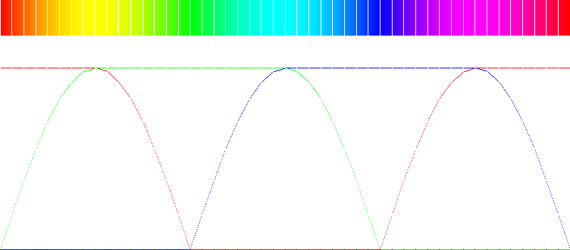
A second relevant problem we detected was that certain areas might be perceived as more narrow or more present due to the fact that their intensity are on average larger. Blue in general requires large intensities before we perceive equally as strong as red or green. Figure 4 demonstrates how a standard huebar looks like when the differences between perceived intensities is accounted for. We modified the red green and blue channel such that they are perceived equally strong.
From this we also find that the secondary colors, which rely on a mixture of two channels, have different perception characteristics. In figure 4 the yellow, turquoise and purple bands are brighter due to the mixing of multiple colors.

|
The problem now is that researchers want maximum intensity ! They don't believe your results (nor their own for that matter) if the pictures look shady and dark. As such it is often unwanted to darken the visual information to achieve an balanced color bar. Therefore, we first created a huebar in which each color has at least one maximal channel. If wanted, we can then normalize this huebar to more balanced intensities.
4 A new huebar
Because our mathematical model of an optical perception didn't work in the least, we followed a more empiric approach. The new huebar we created was obtained by presenting two colors to a viewer and then asking that person to designate the middle between these two colors. Each of these graphs had a maximal potential intensity without compromising the ratio between the colors. For instance, if we want to present a small gradient from red (255,0,0) to green (0,255,0) then we would theoretically go over (128,128,0), which is the middle between the two colors. It was however better to ensure maximal intensity by scaling this value such that the maximal channel has always intensity 255. In this case, the middle between red and green would be (255,255,0), which is yellow.
|
Using this type of gradients we set up a pyramidal system in which we would first determine the middle between a primary and secondary color. We obtained the perceived middle for the following color pairs: red-yellow, yellow-green,green-turquoise, turquoise-blue, blue-purple and purple-red. In the second iteration we obtained the middle between each of the new key points and based on this we are able to determine which colors belong where on a linear scale.
A closer investigation of these values showed that the error of the
original plot is that channels coming into or going out of play should
not be introduced linearly but according to ![]() th Gaussian.
This then gives the results as presented in figure 5.
th Gaussian.
This then gives the results as presented in figure 5.
5 Normalizing the Intensities
For those researchers interested in more correct visualization instead of the shiny beauty of all these colors: to normalize the intensities one can first alter the red and green channels to match the blue one. Afterwards one can normalize the information for the secondary channels in a linear fashion with respect to the distance of a color towards the first primary color. Figure 6 depicts the results.

6 Discussion
The presented hue bars, both the intensity normalized and full intensity one are much better in representing data. One must however observe that on most LCD screens the blue coverage seems somewhat smaller than the other bands. Equally so, the turquoise color seems still somewhat brighter than the other bands. To resolve this we probably should manually alter the huebar.
The huebar we present has a circular topology: the left end (color red) closes nicely with the right end (color red) and if done so, red will occupy the same space as any of the other colors. Often however, one needs to span colors from a minimum to a maximum. In that case, we want as much red as we can get, without becoming too purple and also as much blue as we can, thereby carefully avoiding an overlap or coming to close to each other.
7 Source code
To satisfy the hungry need of all those Internet surfers interested in a solution but not in how one gets there: I've made the following code available for your beloved eyes. Please keep on referring to my work and sent huge amounts of money in my direction. I can provide you with the necessary bank account information to help you out with the payment :-)
The NORM define can be used to specify whether one is interested in intensity normalized images or in the maximum strength stuff.
#include <math.h>
#include <qapplication.h>
#include <qimage.h>
#include <qcolor.h>

const int huecolors=360;
#define NORM

struct RGB
{
  unsigned char r;
  unsigned char g;
  unsigned char b;
};

RGB hue2rgb[huecolors];

void set_hue2rgb_channels(int idx, int r, int g, int b, double I)
{
  if (idx<0) return;
  if (idx>=huecolors) return;

#ifdef NORM
  const double target=0.85;
  I=1-I;
  I=target+I*(1-target);
#else
  const int  I=1;
#endif
  hue2rgb[idx].r=r*I;
  hue2rgb[idx].g=g*I;
  hue2rgb[idx].b=b*I;
}

void init_hue2rgb()
{
  int s1=0;
  int s2=huecolors/3;
  int s3=2*huecolors/3;
  int s4=huecolors;
  int ss=1+(huecolors/3);
  for(int i = 0; i <= ss/2; i++)
    {
      double a=sin(i*M_PI/ss);
      int S=255.0*a;
      double j=2.0*(double)i/(double)ss;
      set_hue2rgb_channels(s1+i,255,S,0,j);
      set_hue2rgb_channels(s2+i,0,255,S,j);
      set_hue2rgb_channels(s3+i,S,0,255,j);
      set_hue2rgb_channels(s2-i,S,255,0,j);
      set_hue2rgb_channels(s3-i,0,S,255,j);
      set_hue2rgb_channels(s4-i,255,0,S,j);
    }
}

int main(int argc, char* argv[])
{
   QApplication(argc,argv);

   const int sx=1000;
   const int sy=100;
   QImage I(sx,sy,QImage::Format_RGB32);
   QColor C;
   init_hue2rgb();
   for(int x=0; x < sx; x++)
     {
       int i=(x*huecolors)/sx;
       int r=hue2rgb[i].r;
       int g=hue2rgb[i].g;
       int b=hue2rgb[i].b;
#ifdef NORM
       r*=195;
       r/=255;
       g*=175;
       g/=255;
#endif
       C.setRgb(r,g,b);
       QRgb A=C.rgb();
       for(int y = 0 ; y < sy; y++)
         I.setPixel(x,y,A);
     }
   I.save("huebar.png","PNG");
}
| http://werner.yellowcouch.org/ werner@yellowcouch.org |  |