| Home | Papers | Reports | Projects | Code Fragments | Dissertations | Presentations | Posters | Proposals | Lectures given | Course notes |
|
|
Pattern Analysis of Human Histone Methylations and Acetylations through Cross Correlation MapsWerner Van Belle1* - werner@yellowcouch.org, werner.van.belle@gmail.com Abstract : This paper investigates how to properly calculate relations between multiple genomic tracks produced by deep sequencing technology. Based on a cross-correlation analysis we measure relations between peak and peaks, peaks and areas and areas and areas over short or long distances. Using this method we revisit previously published acetylation and methylation patterns and present 41 maps, one for each of the measured histone modifications.
Keywords:
histone methylation, acetylation, cross correlation, peak detection, epigenetics |
1 Introduction
Recent advances in sequencing technology made it possible to
sequence
large amounts of a variety of input material. Among these is the
possibility
to measure protein DNA binding positions through chromatin
immunoprecipitation
(CHIP). Zhao, Wang, Barski and others performed such experiments and
generated tracks for a large collection of human histone methylation
and acetylation modifications [1, 2].
This amounted to around  bases, which poses interesting
analysis challenges. One of the modern questions regarding such signal
tracks is how various patterns within one track correlate with patterns
in another track.
bases, which poses interesting
analysis challenges. One of the modern questions regarding such signal
tracks is how various patterns within one track correlate with patterns
in another track.
Current strategies to analyze this type of data consists of trying to develop peak-finders to find binding positions and then find some meaningful relation between the occurrence of a peak and the presence of transcription for instance. Although this approach seems simple, it is essentially an object recognition problem and it is not at all clear that a simple model of Gaussian peaks is actually a proper one. Techniques such as deconvolution and hidden Markov models might be appropriate, it is however premature to decide on which underlying signal model is a correct one. Furthermore, converting this type of profile to a collection of peaks makes certain statistical procedures later on quite complicated. It is for instance unclear how peaks can be correlated between different tracks without specifying an arbitrary factor that specifies when two peaks are sufficiently similar (Stated differently: what is the minimum allowed shift before two peaks are treated as distinct peaks ?).
Another strategy often employed to analyze this type of data is to rely on known information and then partitioning the data into subsets or regions and then compare average signals across these subsets. For instance in many papers the genomic track is immediately divided in active and inactive genes after which profiles from these different types of classes are compared. When one tries to plot error bars on this type of plots, one quickly discovers the limitations of this approach since the error bars are completely off the chart.
Further scientific errors are often made:
- Many observations and claims are not correctly tested (Correlations for instance)
- Often demonstrations are used to prove some correlation (high versus low activity plots)
- Often 'representative' samples are used to give a wrong impression on the overall data.
2 Experimental Setup
We downloaded the methylation and acetylation tracks with accession
numbers SRA00206 [1] and [2] from the short read archive at NCBI [3]. The 20 methylations are ![]() ,
, ![]() ,
,
![]() ,
, ![]() ,
, ![]() ,
,
![]() ,
, ![]() ,
, ![]() ,
, ![]() ,
,
![]() ,
, ![]() ,
, ![]() ,
,
![]() ,
, ![]() ,
, ![]() ,
, ![]() ,
,
![]() ,
, ![]() ,
, ![]() and
and
![]() . The 18 acetylations are
. The 18 acetylations are ![]() ,
, ![]() ,
,
![]() ,
, ![]() ,
, ![]() ,
, ![]() ,
,
![]() ,
, ![]() ,
, ![]() ,
, ![]() ,
, ![]() ,
,
![]() ,
, ![]() ,
, ![]() ,
, ![]() ,
, ![]() ,
,
![]() and
and ![]() . Aside from these there were
also tracks for
. Aside from these there were
also tracks for ![]() ,
, ![]() and
and ![]() . Sadly enough there were no RNA-SEQ tracks for the specific samples.
. Sadly enough there were no RNA-SEQ tracks for the specific samples.
The original data size of all these tracks is around ![]() bases, which takes around 231 GB. We aligned each of these tracks
to the Human genome using a non standard invocation of Eland [4] such that it would also produce position information for hits aligning
to multiple positions (multi-hits). The alignment files took around
35GB.
bases, which takes around 231 GB. We aligned each of these tracks
to the Human genome using a non standard invocation of Eland [4] such that it would also produce position information for hits aligning
to multiple positions (multi-hits). The alignment files took around
35GB.
From these alignments on, we generated a genome wide signal track
for each of the different methylations and acetylations. This was
done through a modified version of Eland2Wig ([5], which was able to handle the specialized
output of the multi-hit alignment. Initially, each multi-hit was fully counted at each of
its aligning positions (weight = 1), although in later situations
we experimented with a weighing factor of ![]() and a weighing
factor of 0. The last option is also the standard behavior of the
Illumina pipeline. Each alignment start position was then extended,
thereby taking the alignment direction into account. We used two
different
approached. Originally we used only the read length (24, 25, 26 or
35, 36, depending on the experiment), such that each position in the
genome would reflect how many times that base was sequenced.
A second approach relied on extending each alignment up to the average
fragment length (160 base pairs)as put on
the flowcell. So the
signal tracks would consequently reflect how many times a specific
base was present in the sample.
and a weighing
factor of 0. The last option is also the standard behavior of the
Illumina pipeline. Each alignment start position was then extended,
thereby taking the alignment direction into account. We used two
different
approached. Originally we used only the read length (24, 25, 26 or
35, 36, depending on the experiment), such that each position in the
genome would reflect how many times that base was sequenced.
A second approach relied on extending each alignment up to the average
fragment length (160 base pairs)as put on
the flowcell. So the
signal tracks would consequently reflect how many times a specific
base was present in the sample.
To compare the signals surrounding transcript start sites across methylations/acetylations we extracted little vectors (in the mathematical sense) of around 2000 floating points and stored them separately on disk . The transcription start sites were taken from the Ensembl database (homo_sapiens_core_47_36i) and resulted in around 22000 transcripts. For each transcript we generated three different vectors. Each of these vectors would have the first half (the first 1000 bases) reflect the upstream region and the second half would be one of the following three downstream regions.
- The first downstream region was the transcript itself. Hereby we simply removed all of the exons and scaled the full length of the transcript to the 1000 bases required for the second half of the signal vector.
- The second downstream extraction consisted of an alternation of exons and introns, up to 10 exons. Each exon or intron was scaled to a length of 52 bases and placed behind each other in the signal vector. Areas without a signal (this occurs for transcripts with less than 10 exons) were annotated as 'unknown'.
- The third downstream extraction was a copy of the downstream genomic region, disregarding any exon or intron information.
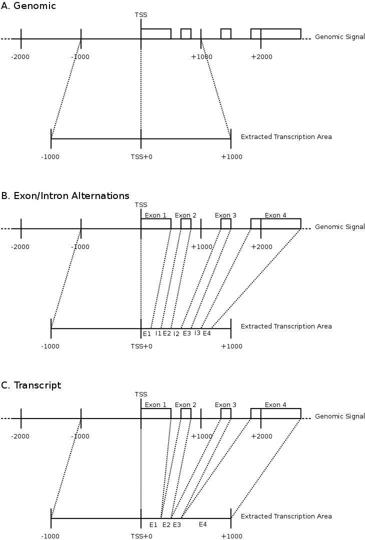 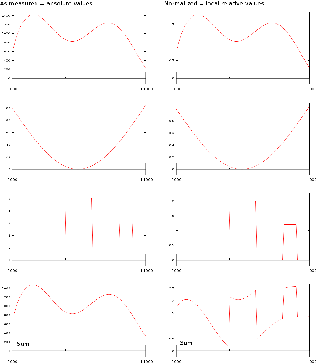 |
Figure 1 illustrates the different extractions. For each of the extractions, the transcription direction was taken into account and we removed all transcripts that would overlap with different genes.
A last aspect on the TSS Area extraction was the question whether we should normalize each of the vectors. If we would normalize each TSA such that the total sum would be the same, then each transcription area would have the same weight in subsequent analysis steps. Whether normalization or not is appropriate in this type of analysis is still unclear. We experimented with both approaches.
All these different considerations lead to 12 different data sets of
transcription areas. One for each combination of area normalization
(absolute versus relative), fragment extension (to the read length
or to the selected 160 bases) and transcription area extraction
(transcript
only versus exon/intron alternations versus the genomic signal). These
are summarized in table 1.
|
||||||||||||||||||||||||||||||
3 Algorithm
3.1 Correlation
 |
A typical question when dealing with this type of data is whether
specific areas around the transcription start site (TSS) correlate
with each other (Figure 2). One can
for instance
have an RNA track (obtained with RNA-SEQ) and compare it against a
DNA protein binding track (CHIP-SEQ), or one could ask the more
specific
question whether ![]() correlates against
correlates against ![]() at
the transcription start site. Obviously the next question would be
whether such a correlation exists before or after the transcription
start site. To approach this problem we started to systematically
correlate each position around the transcription start site from one
track against each potential position around the TSS in the second
track.
at
the transcription start site. Obviously the next question would be
whether such a correlation exists before or after the transcription
start site. To approach this problem we started to systematically
correlate each position around the transcription start site from one
track against each potential position around the TSS in the second
track.
This process is illustrated in Figure 3A.
For each of the potential positions around the TSS, we aggregate the
value for each of the known genes. For each pair of positions, this
results in two vectors which are then correlated using a spearman
rank order correlation. In our example, we would aggregate all the
values at the transcription start sites for the ![]() signal
(first red line) and for the
signal
(first red line) and for the ![]() signal (first blue line). The
value obtained after correlation is then placed into the
correlation graph
at the TSS. The same process would be repeated for position
signal (first blue line). The
value obtained after correlation is then placed into the
correlation graph
at the TSS. The same process would be repeated for position ![]() ,
with
,
with ![]() ranging from
ranging from ![]() (second red
and
blue line). Figure 3A shows the
direct correlation
between the TSS and surrounding area between
(second red
and
blue line). Figure 3A shows the
direct correlation
between the TSS and surrounding area between ![]() and
and
![]() .
.
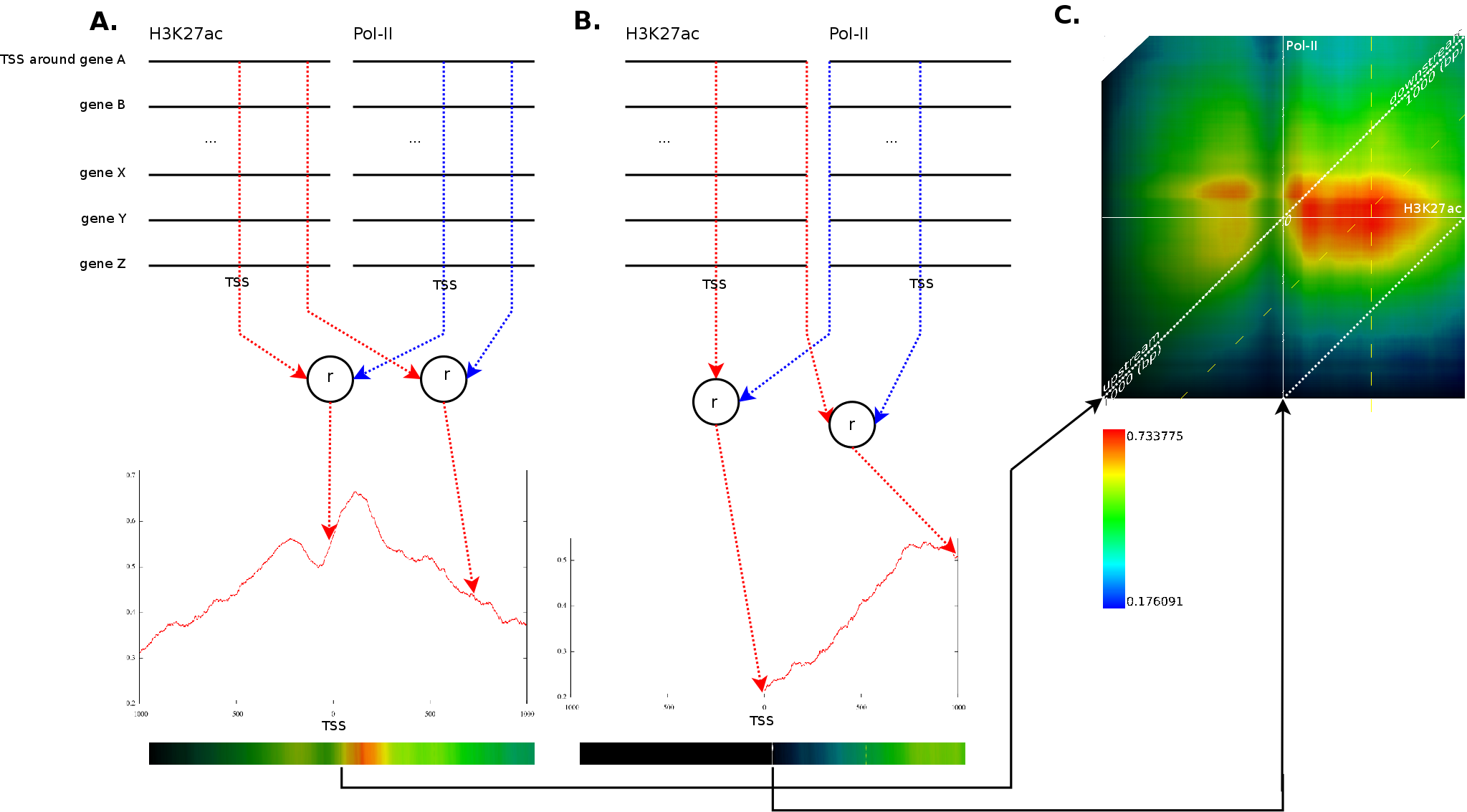 |
This process would then also be repeated for each possible combination
of ![]() against every
other
against every
other ![]() . Figure 3B
illustrates the correlation between
. Figure 3B
illustrates the correlation between ![]() at the
at the ![]() (first red line) against the
(first red line) against the ![]() signal at
signal at ![]() (first
blue line).
(first
blue line).
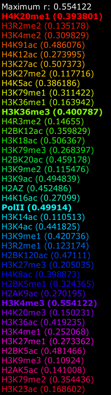
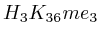
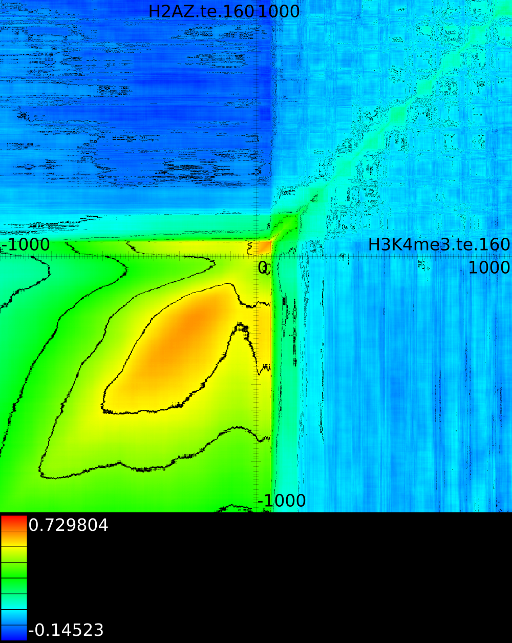
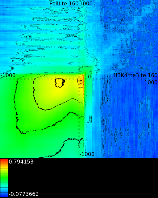
Because we have around 2000 correlation values for each potential translations, which amount to another 4000 positions), we need a good manner to visualize the results. This is achieved by converting each correlation profile to a line in which the x-coordinate reflects the position in the static track and the hue (the color) reflects the strength of the correlation. Each of these lines is then placed in a 2 dimensional map in which the height reflects a translation of the dynamic track. The middle of the map reflects no shift between the static and dynamic signal. If we go up, the dynamic signal was shifted to the left, if we go down the dynamic signal was shifted to the right. Figure 3C presents this idea. The intensity of a pixel in the correlation map reflects the variance of the two signals. If we find a vertical dark line it means that the static signal had a very low variance around this area. A vertical slanted line indicates a low variance in the dynamic track at that specific position.
A strong correlation at position ![]() in those
correlation
maps indicates that the behavior at position
in those
correlation
maps indicates that the behavior at position ![]() (signal versus
no signal) will be similar to the behavior at
(signal versus
no signal) will be similar to the behavior at ![]() in the second
track. In figure 3C the maximum
correlation
appears at
in the second
track. In figure 3C the maximum
correlation
appears at ![]() between a
between a ![]() track
(fixed) and a
track
(fixed) and a ![]() track
(dynamic). This indicates that the
track
(dynamic). This indicates that the ![]() signal at
signal at ![]() will
correlate strongly (
will
correlate strongly (![]() )
with the
with
)
with the
with ![]() signal at
signal at ![]() . As can be observer, one
interesting
aspect of these plots is that we can directly answer which positions
will strongly relate to each other, even when it involves a translation
of one the signaling tracks.
. As can be observer, one
interesting
aspect of these plots is that we can directly answer which positions
will strongly relate to each other, even when it involves a translation
of one the signaling tracks.
3.2 Patterns
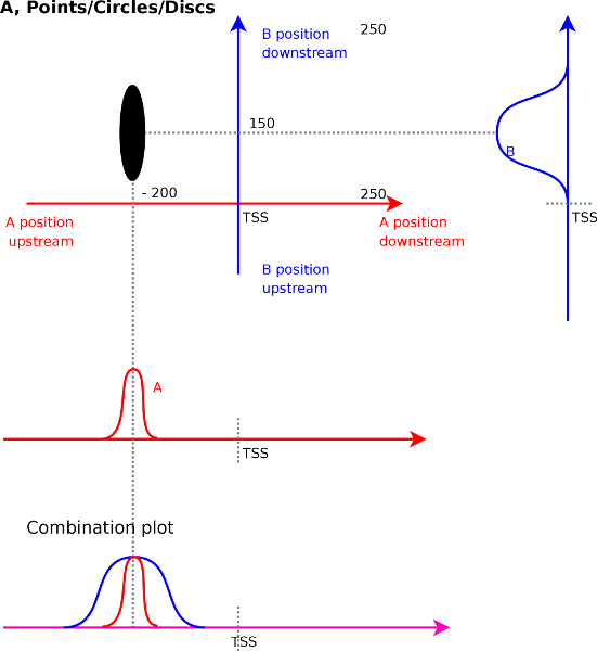 |
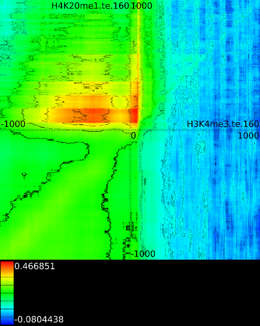
When measuring the correlations we do not only find single unique strong
correlations. In general correlations will co-localize and appear as
larger discs or ellipses, which directly indicates the size of the
peak over which correlation could be measured. Figure
4A
illustrates this. We find a strong correlation for signal ![]() at
at
![]() with signal
with signal ![]() at
at ![]() . The width of the ellipse
is around 50 bases and its height is 200 bases. This indicates that
a peak of around 50 bases wide in the
. The width of the ellipse
is around 50 bases and its height is 200 bases. This indicates that
a peak of around 50 bases wide in the ![]() track correlates with a
200 bases wide peak in track
track correlates with a
200 bases wide peak in track ![]() .
.
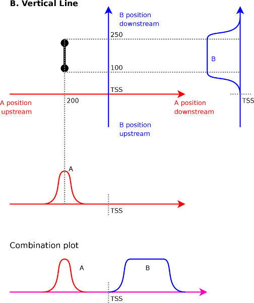   |
Aside from the expected correlations between peaks, other patterns will emerge in the correlation maps as well. These are horizontal lines, vertical lines and diagonal lines. We discuss each of the cases below because each of them has a specific and important meaning.
To understand what a vertical line means (Figure 4B)
it is best to understand what the two endpoints of such a line mean.
Afterward we can interpolate between them and get a better
understanding
of the full picture. Let us assume for the sake of argument that we
have a vertical line from ![]() to
to ![]() in a correlation map between
in a correlation map between ![]() (x-axis) and
(x-axis) and ![]() (y-axis). The
first
endpoint tells us that signal
(y-axis). The
first
endpoint tells us that signal ![]() at
at ![]() will correlate with
signal
will correlate with
signal ![]() at
at ![]() . The second endpoint tells
us that signal
. The second endpoint tells
us that signal
![]() at
at ![]() will correlate with signal
will correlate with signal ![]() at
at ![]() .
Interpolating between these two extremes reveals that
.
Interpolating between these two extremes reveals that ![]() at
at ![]() will correlate with
will correlate with ![]() ranging from
ranging from ![]() to
to ![]() .
.
A horizontal line in the correlation maps (Figure 4C)
has a similar meaning although in this case signal ![]() will be localized,
while signal
will be localized,
while signal ![]() will cover an
entire area. Assume that we have a
line from
will cover an
entire area. Assume that we have a
line from ![]() to
to ![]() . At
the first endpoint we know that signal
. At
the first endpoint we know that signal ![]() at
at ![]() correlates
with the signal
correlates
with the signal ![]() at
at ![]() . The second endpoint
indicates
that signal
. The second endpoint
indicates
that signal ![]() at
at ![]() correlates with signal
correlates with signal ![]() at
at ![]() .
Interpolating between these two extremes shows that we will have a
correlation between
.
Interpolating between these two extremes shows that we will have a
correlation between ![]() at
at ![]() and
and ![]() ranging from
ranging from ![]() to
to ![]() . We find that vertical or horizontal lines
indicates a correlation between a local element (peaks for instance)
and a larger element (such as an entire area).
. We find that vertical or horizontal lines
indicates a correlation between a local element (peaks for instance)
and a larger element (such as an entire area).
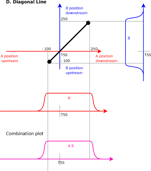
Diagonal lines (Figure 4D) is
the last case
that commonly occurs and indicates that two large areas directly
correlate
against each other. Assume a line from ![]() to
to
![]() . The first point implies that signal
. The first point implies that signal ![]() and
and ![]() correlate at
correlate at ![]() . The second endpoint
implies that
signal
. The second endpoint
implies that
signal ![]() and
and ![]() correlate at
correlate at ![]() . Interpolating between
these two leads to a correlation between signal
. Interpolating between
these two leads to a correlation between signal ![]() (range
(range ![]() to
to ![]() ) and signal
) and signal ![]() (range
(range ![]() to
to ![]() ).
).
In general diagonal lines will bloom out a bit (Figure 7A)
because of a transitive closure between three correlations. When signal
![]() and
and ![]() correlate at
correlate at ![]() , at
, at ![]() and
and ![]() , then
so will signal
, then
so will signal ![]() at
at ![]() and
and ![]() because the behavior of
the signal at points
because the behavior of
the signal at points ![]() ,
, ![]() and
and ![]() will very likely be similar
as well. If the blooming is small then one can assume there is a
specific
positional effect driving the correlations. The blooming effect is
larger for diagonal lines that do not go through the origin. If the
diagonal correlations are very localized one might also start thinking
about a sequence specific bias and we did indeed find these. We come
back to them in section 4.1.
will very likely be similar
as well. If the blooming is small then one can assume there is a
specific
positional effect driving the correlations. The blooming effect is
larger for diagonal lines that do not go through the origin. If the
diagonal correlations are very localized one might also start thinking
about a sequence specific bias and we did indeed find these. We come
back to them in section 4.1.
At the moment we know that the correlation maps can exhibit patterns
which make it possible to find relations between peaks
and peaks
(discs or ellipses), peaks and areas (vertical
and horizontal
lines) and between areas and areas (large
correlation patches).
|
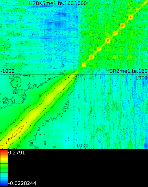
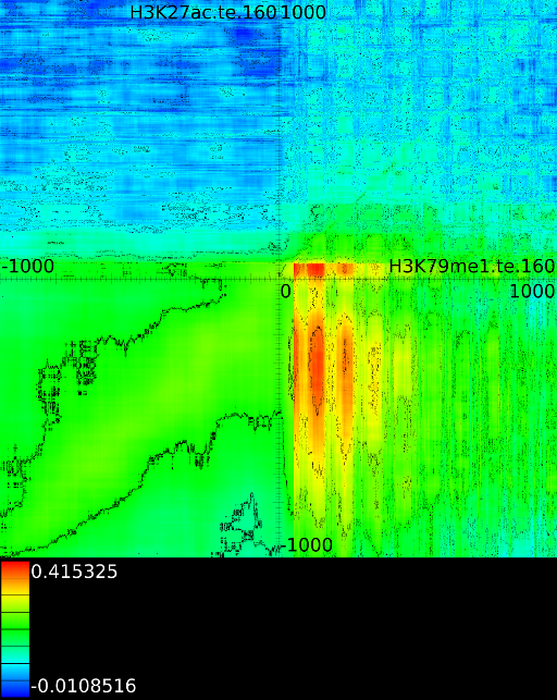
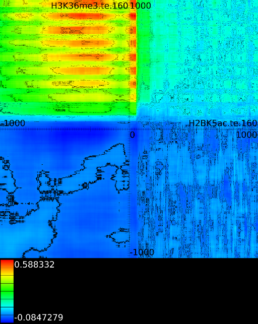
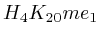
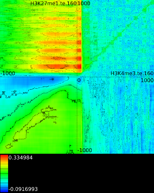
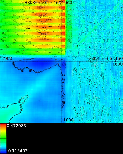
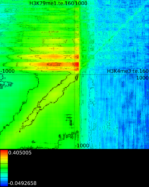
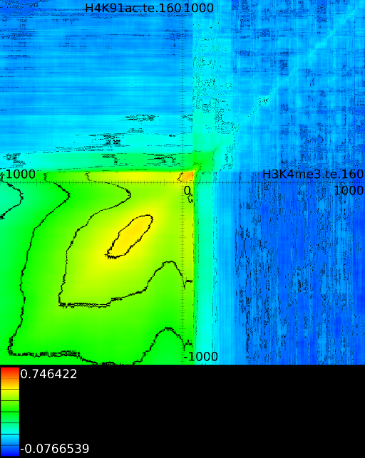
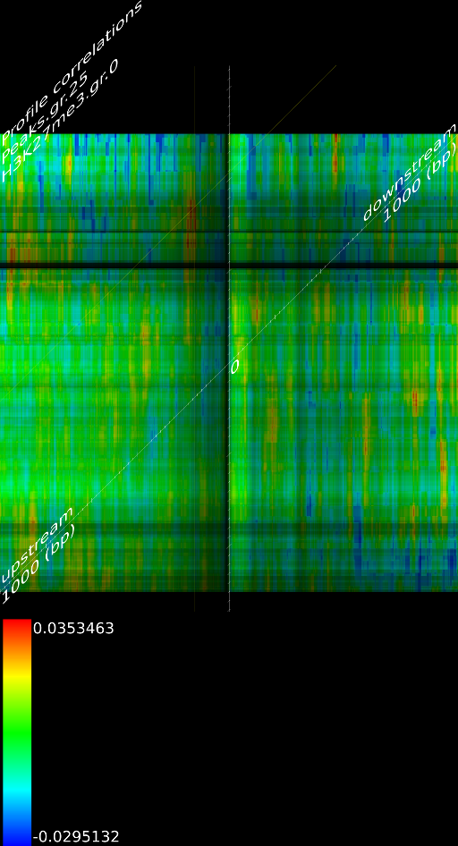
To demonstrate some of these patterns we selected 4 correlation maps
(Figure 5). The first one
shows a localized
correlation between ![]() and
and ![]() (Figure 5A).
In this example the
(Figure 5A).
In this example the ![]() at
at ![]() correlates
with the
correlates
with the ![]() signal at
signal at ![]() . The width of
this correlation is around 100 base pairs.
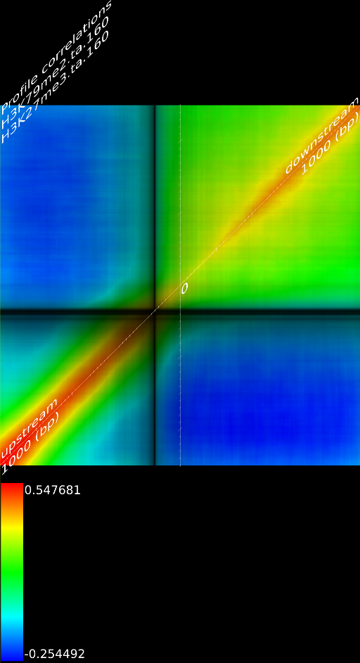
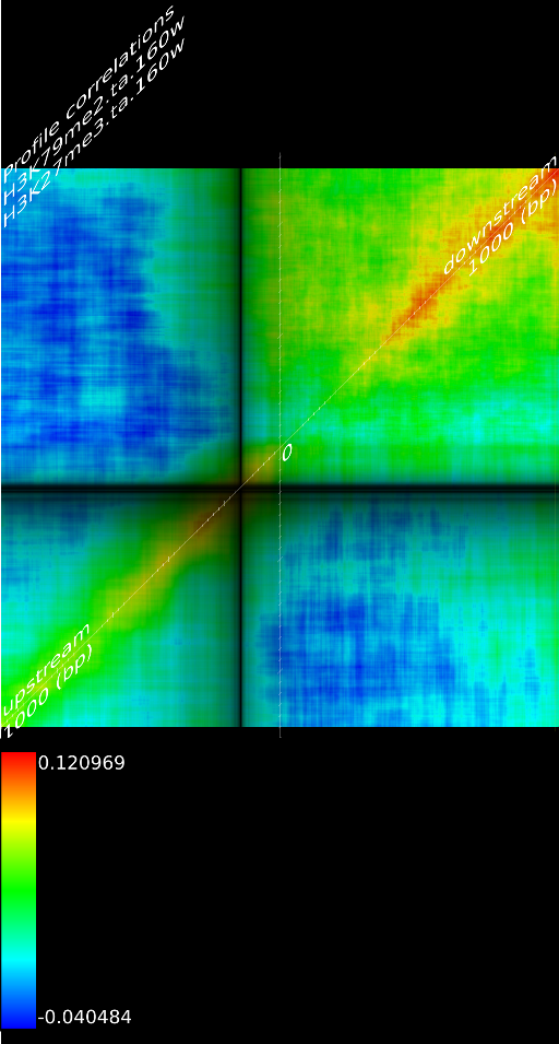
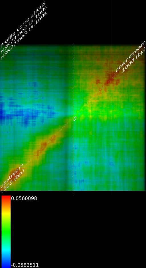
Figure 5B shows a diagonal
correlation
pattern through the
. The width of
this correlation is around 100 base pairs.
Figure 5B shows a diagonal
correlation
pattern through the ![]() for
for ![]() and
and ![]() .
These indicate that the both signals correlate well with each other,
regardless of the respective position around the
.
These indicate that the both signals correlate well with each other,
regardless of the respective position around the ![]() . In this case
. In this case
![]() correlates with
correlates with ![]() with
with ![]() .
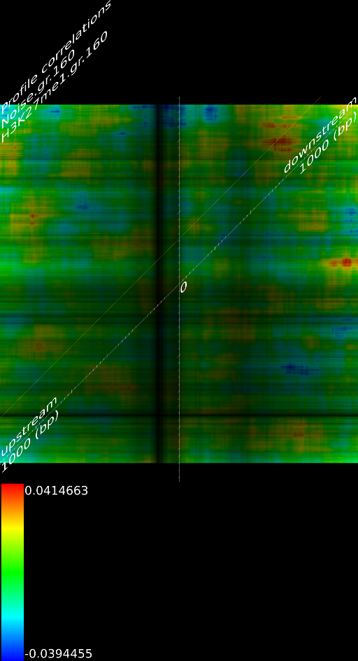
Figure 5C demonstrates a
number of
vertical correlations between
.
Figure 5C demonstrates a
number of
vertical correlations between ![]() and
and ![]() .
The signal at
.
The signal at ![]() , intron 1, exon 2 and exon 3 correlate
with a signal of
, intron 1, exon 2 and exon 3 correlate
with a signal of ![]() in front of the
in front of the ![]() (from
(from ![]() to
to ![]() ).
Interesting here is also that the
).
Interesting here is also that the ![]() signal
at intron1, exon2 and exon3 correlate with the
signal
at intron1, exon2 and exon3 correlate with the ![]() signal
in the first exon1. Figure 5D
shows
a number of horizontal correlation patterns between
signal
in the first exon1. Figure 5D
shows
a number of horizontal correlation patterns between ![]() and
and ![]() . Here, the
. Here, the ![]() area from
area from ![]() to
to ![]() and the
first exon correlates with the
and the
first exon correlates with the ![]() signal in exon 4 to exon 10.
signal in exon 4 to exon 10.
3.3 Correlation Mining
Using the histone methylation and acetylation patterns, we calculated
in total around ![]() correlations, a number sufficiently
large to start thinking about finding important correlations
automatically.
The tool we developed will take from a collection of correlation
maps the strongest ones and present them in a combined map (called
the maximized map). The color in the maximized map no longer reflects
the strength of a correlation, this is now shown through the the pixel
luminosity. The color itself is now used to reflect the map with the
strongest correlation at that particular position. By then reading
the color one can find out which correlation map was the reason for
a large correlation. The colors are chosen such that neighboring
correlation areas will have a high color contrast.
correlations, a number sufficiently
large to start thinking about finding important correlations
automatically.
The tool we developed will take from a collection of correlation
maps the strongest ones and present them in a combined map (called
the maximized map). The color in the maximized map no longer reflects
the strength of a correlation, this is now shown through the the pixel
luminosity. The color itself is now used to reflect the map with the
strongest correlation at that particular position. By then reading
the color one can find out which correlation map was the reason for
a large correlation. The colors are chosen such that neighboring
correlation areas will have a high color contrast.
  B & C 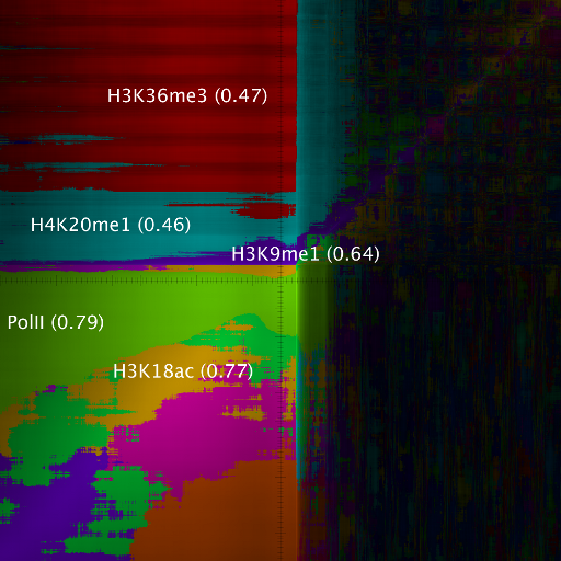 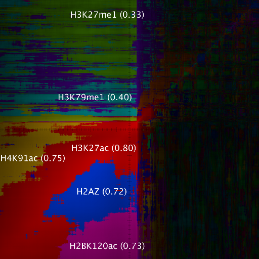 |
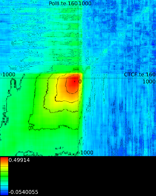
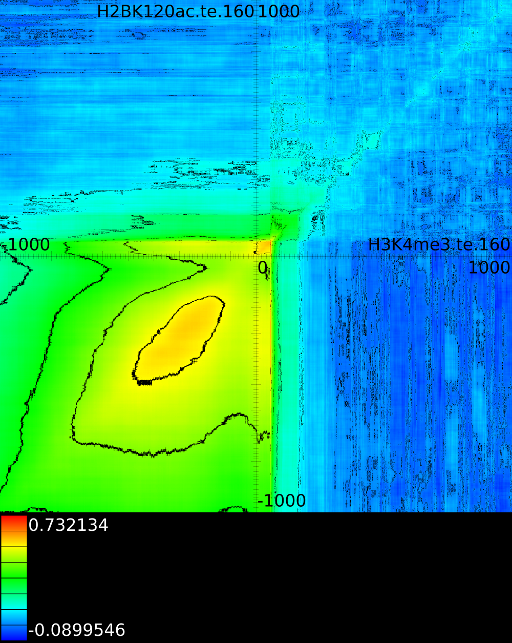
Figure 6 presents three
maximized correlation
maps. Figure 6A shows the
maximized output
for all the maps involving ![]() horizontally. What directly becomes
apparent is that none of the methylations patterns relate in any
significant
manner to the CTCF track in the gene body. In front of the
horizontally. What directly becomes
apparent is that none of the methylations patterns relate in any
significant
manner to the CTCF track in the gene body. In front of the ![]() however
we find that certain areas correlate sufficient towards
however
we find that certain areas correlate sufficient towards ![]() . To
read these plots one can start for instance at the TSS and assume
that we have a CTCF signal there, then one start 100 bases in front
of the
. To
read these plots one can start for instance at the TSS and assume
that we have a CTCF signal there, then one start 100 bases in front
of the ![]() , which is in
the map 100 bases down. There we
find
, which is in
the map 100 bases down. There we
find ![]() , if we now go
into the gene body (that is up
on the plot) we find that when there is a CTCF signal at the
TSS,
we will find in succession the following strong correlations:
, if we now go
into the gene body (that is up
on the plot) we find that when there is a CTCF signal at the
TSS,
we will find in succession the following strong correlations: ![]() up to the 4th exon and then
up to the 4th exon and then ![]() from exon4
on.
from exon4
on.
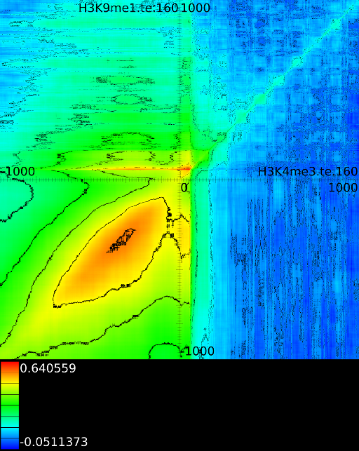
Of course, since we only show the maximal correlations, certain
areas
can be masked out and not visible despite that they also have a strong
correlations. To make these visible we can retrieve multiple layers
of the correlation map. The first layers includes all correlation maps.
The second layer only includes the correlation maps that where not
sufficiently present in any of the previous maps. If we do this for
![]() (Figure 6B
and 6C)
we find that a strong
(Figure 6B
and 6C)
we find that a strong ![]() signal in
front of the
signal in
front of the ![]() relates to the following other histone modifications:
relates to the following other histone modifications:
- From exon 4 to exon 10:
 (
( , first layer)
and
, first layer)
and 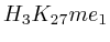 (
( 2nd layer)
- From exon 2 to intron 3:
 (
( , 1st layer)
and
, 1st layer)
and 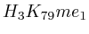 (
( , 2nd layer)
- Up to exon 2:
 (
( , 1st layer)
- From
 to
to  : 1st layer:
  with
with  . The
second layer starts to make a distinction between the
. The
second layer starts to make a distinction between the  signal position. If it is from
  to
to  we find the
strongest correlation towards
we find the
strongest correlation towards  (
( ). From
  to
to  we find the strongest
correlation towards
we find the strongest
correlation towards  (
( ).
).
|
3.3.1 Significantly altered correlations
A second technique employed by the maximizer is the possibility to show only significantly altered correlations. The rationale behind this was that in one of our initial experiments we found that the upstream region would always exhibit strong correlations. In the end it turned out that the signal mainly reflected whether an exon or intron was present and this 'hidden' factor would drive the correlation upwards. Although we need to come back to these hidden factors in section 4.3, we tested an approach in which we would use all 41 correlation maps and assess what the expected correlation was at each position. Once we had the expected correlation it was not difficult to only report the most significant altered correlation. This approach is somewhat adhoc because we no longer know how strong the correlation, barring all hidden factors, really is.
4 Data Analysis Results & Discussion
In this section we will further bring together the different approaches we tried and report on which techniques worked and which should be avoided, including argumentation
As an initial test of our algorithm we created a random track in
which
we placed 10000 random peaks and correlated these against one of the
signal tracks (Figure 8A). As a ![]() test we correlated a signal track against a track that contained
100'000'000
random alignments (Figure 8B). In
none of the
cases did we find a correlation that was worrisome. They were all
below the correlation strength that one expects with 20000
transcription
start sites (~0.03)
test we correlated a signal track against a track that contained
100'000'000
random alignments (Figure 8B). In
none of the
cases did we find a correlation that was worrisome. They were all
below the correlation strength that one expects with 20000
transcription
start sites (~0.03)
|
4.1 Fragment
Extension
We first report on the difference between relying on only sequenced bases (extend alignment positions up to the read-length) against the bases present in the sample (extend alignments up to the fragment length).
If we do not extend the fragments we find that the alignment will mainly measure the areas where the fragmentation process choose to break up DNA strands. This is confirmed by pointing out that the maximized map of methylation correlations only shows strong correlations at the diagonal. This indicates a strong positional bias and maybe even a lighter form of sequencing bias. In this case, the ultra high resolution of the sequencing technology is somewhat of a disadvantage because most researchers are not interested in understanding where the fragments got broken up. They merely want to know whether a specific base was in the sample.
When we extent each aligned fragment to 160 bases we find stronger correlations, which indicates that the non-extended interpretation has a certain amount of sampling noise. Secondly, the extended alignment lead to correlation maps that do not only have strong correlations near the diagonal. Both make for a compelling argument to perform a smoothing on the data. If one wants to use deep sequencing data to study CHIP-SEQ data, it is necessary to extend all the alignment position up to the expected fragment length. If one is interested in sequencing errors and positional biases then of course this should not be done.
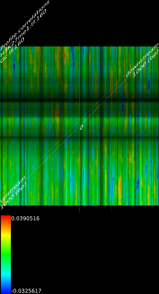
Because a positional bias might have been related to the GC content of the genome we correlated the GC content of a random track against its measured signal and we did not find any significant correlation (Figure 8C).
4.2 Data Normalization
Up to now we did not go into much detail regarding the two normalization schemes we used (Fig. 1B). The idea was that one can of course use the signal as measured. However, since we compare them against each other it might have been useful to make some form of internal control such that each transcription area is normalized internally. The rationale behind this was that certain phenomena could affect chip binding or transcription at a kilobase resolution: e.g: is this part of the chromosome close to the centromere, is it accessible etcetera. The second reason we considered normalization was that, if we would want to create a predictor of transcription start sites based on the measurements it is necessary to be able to normalize each vector individually; independent of some peculiarities that might have affected the signal strength. As a third reason we considered that the shape of some of some curves could be related to transcription start sites and not the absolute signal.
After doing some testes we found that normalization offers little quantitative difference with respect to the maximal correlations. There is however a qualitative difference which can be best understood by looking at how curve shape, normalization and signal strength intertwine.
In the first case (Fig. 1B) where we only use the measured value we find that transcript areas with strongest signal will tend to dominate the final profile. This in itself is not such a good thing because it leads to the wrong impression that the shape of the average signal is the average shape, which it in reality is not. The final shape can be driven by some outliers. This problem of outliers however is limited in the case of the correlator because the signals are ranked before they are fed into a linear pearson correlator. This ranking process aside, the correlator will still not be able to recognize specific shapes in the signal.
In the second case, when we normalize the data, we find that if there is a common shape present this shape will be preserved in the final profile. In contrast to the previous absolute interpretation, not a single vector can now dominate the total profile. It is however still possible that a large group of similarly behaving genes (inactive genes) altogether affect the outcome due to an amplification of 'no signal'.
When used in a correlation context (based on spearman rank order correlation) it seems most appropriate to not normalize the data. However, when creating profiles, it seems more appropriate to use both approaches and observer the differences between them.
4.3 Multi-hits
|
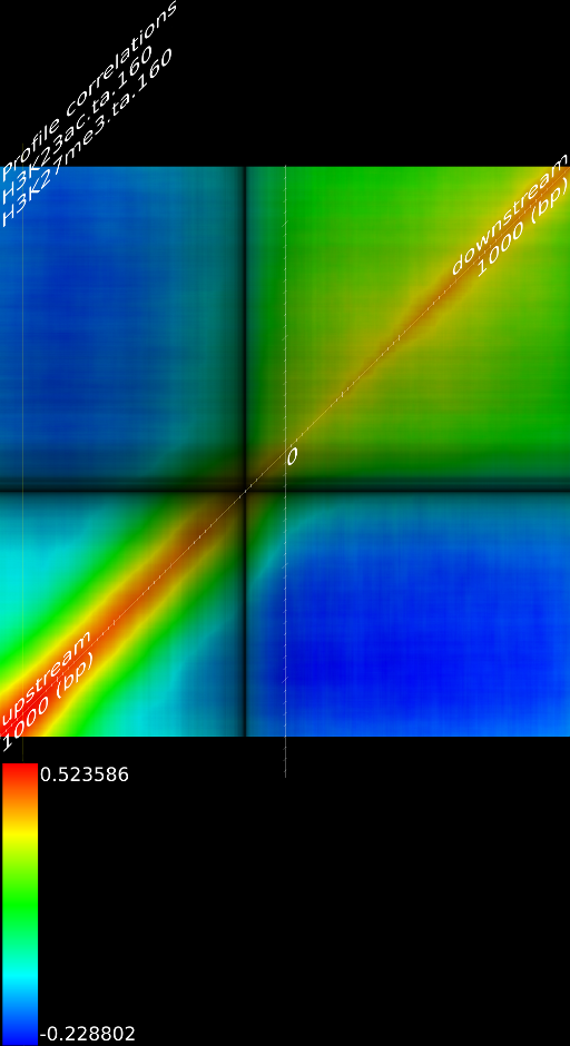
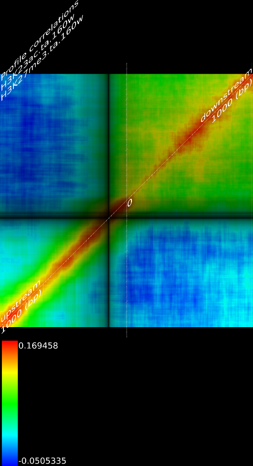
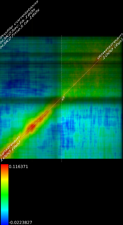
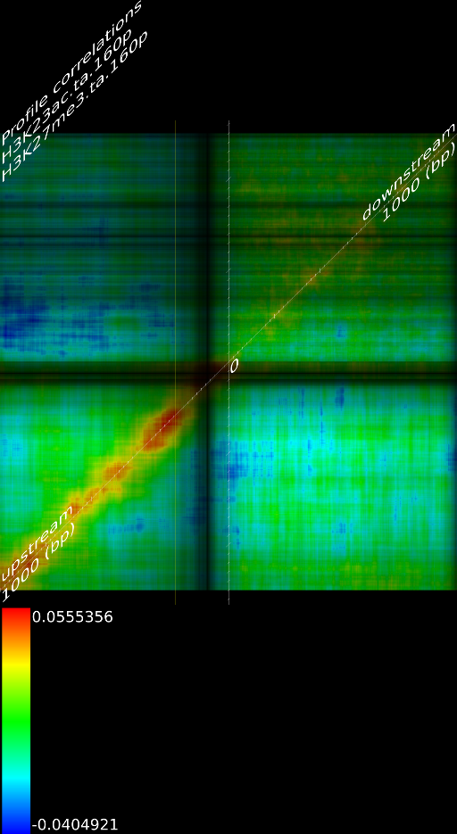
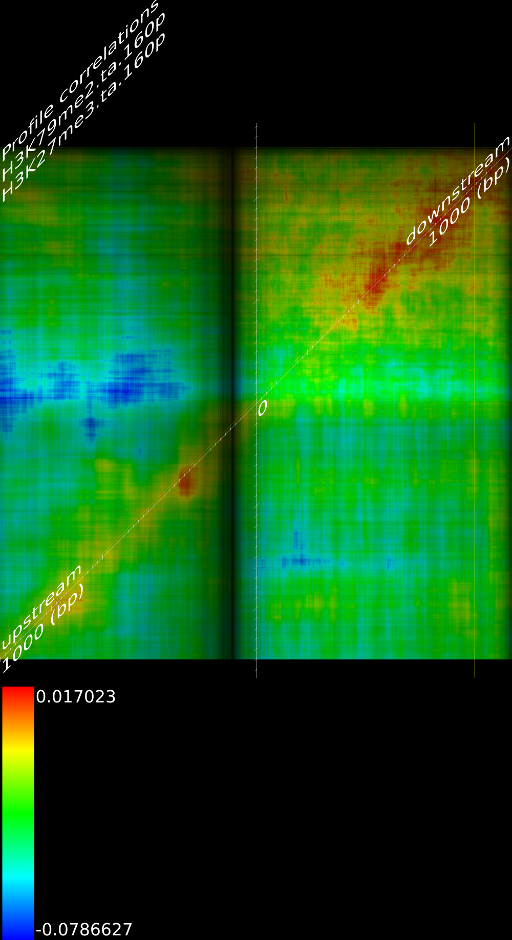
One of the most important observations from the preliminary results was that all correlations were positive in the upstream region around 1000 bases and within the intron areas. A closer investigation revealed that although many genes had no signal in the introns, some of them did so in abundance in all tracks. This made us reexamine the assumption that we could treat multi-hits as repeated single hits and we did a number of small experiments to verify the impact multi-hits had on the correlation values. Figure 9 illustrates some of these results.
In most cases, the correlation values would be around 0.52 if we counted each hit individually. If we weighed each multi-hit the correlations lowered to a maximum of 0.17, and when we relied only on the uniquely matching hits (weight=0), the correlations lowered to 0.12. In another case we found that counting each multi hit provided us with a correlation of 0.63, weighing them gave 0.27 and only counting unique ones gave a value of 0.13.
Because the treatment of multi-hits had such a high impact on the
correlation and because none of the three approaches are scientifically
correct, we started to think about a better strategy to deal with
multi-hits, which would preserver the measured information correctly.
For repeat areas we don't know how many times a specific base was
present in the sample, as such we marked these areas as 'unknown'
and passed this information to the correlator which would then treat
these points as missing values. This precise interpretation led to
an even more dramatic lowering of the correlations: to 0.055 in case
of  and to 0.017 for
 ![]() .
When using the precise interpretation of the data we also no longer
found the intron correlations. This indicates that none of the commonly
used methods to deal with multiple alignments is appropriate when
a subsequent analysis step involves correlations.
.
When using the precise interpretation of the data we also no longer
found the intron correlations. This indicates that none of the commonly
used methods to deal with multiple alignments is appropriate when
a subsequent analysis step involves correlations.
4.4 Exon/Intron correlations
The realization that we sometimes find different correlation strengths between exons and introns might indicate that it could be possible to detect whether something is an exon or intron solely based on the histone methylation/acetylation patterns. This might be possible, however one should carefully note a number of limitations of using these correlations in a predictive context. The first limitation is that we rank the data set so we cannot directly go from the measured signal to a rank independent of knowing where the other exons/introns are. Of course, the spearman rank order correlation is often a more stringent measure than the linear pearson correlation, we might assume that the LP correlation could be higher and this ranking problem might not really be a problem.
The second observation is that the scale of the images is dynamically determined based on the maximum correlation and none of the correlations are of such high value that we can readily jump from an apparent pattern to a predictor. That is: a correlation of 0.58 in Figure 5D and a correlation of 0.41 in Figure 5C do not comfortably suggest that it might be possible to use the data directly as a univariate predictor.
The third observation is that we not only need to look at the correlation strength in the exons (which is low), but also whether we will be able to distinguish between the correlations in the introns. If we look at the difference between the exons and introns in correlation strength the picture becomes even more bleak: 0.0735 for 5D and 0.052 for 5C. Obviously it will be a pretty hard task to use such correlations to distinguish between exons and introns. This also illustrates that the correlation maps should be read with care. The hue color scheme is optimal to allow us to recognize specific areas, but the actual correlation values should not be omitted in an interpretation.
5 Conclusion
In this article we presented a novel methodology to calculate correlations between genomic signal tracks. For instance, one can correlate each position around the TSS of one signal track against the signal at another position around the TSS of a second signal track. We observed that the resulting correlation maps tend to be composed of discs, ellipses, horizontal, and vertical lines. Such recurring patterns can be interpreted as correlations between peak/peaks, peaks/areas or areas/areas.
In order to sort through 21000 of these correlation maps we created an automatic correlation finder that presents layers of maximal correlations in a coherent fashion.
We furthermore found that repeat areas, and more specifically, hits with multiple alignment positions should be treated as missing data. None of the three existing options nowadays: (not counting, weighing, treating each of them as an individual) respects the measured data and this leads in almost all cases to higher correlations. By treating missing data as such, we saw correlations lower from 0.52, to 0.17, to 0.12 to 0.05 in one case and from 0.63, to 0.27, to 0.13 to 0.017 in another case.
Extending aligned fragments to the selected fragment size of, for instance 160 bases, improves the correlations. Without fragment extension the data seem to be positionally biased.
Transcription areas can be or cannot be normalized. There is mainly a qualitative impact. With normalization the correlations might lower due to amplification of noise, the shape of the profiles is however taken into account. Without normalization, the shape of the curves is not taken into account.
We also found that the GC content of the genome does not affect the measurement sufficiently to be of concern. The observation that most of the patterns correlate across longer stretches indicates that the widely perceived model of peaks is premature and although histones might bind at specific positions, this is certainly not the only interpretation that one should give to the data.
Acknowledgments
I would like to thank Christian Beissel for introducing me to the field of epigenetics, a field which is otherwise unknown to me. And of course Philipp Bucher, who has shown great interest in this article. If it where not due to administrative constraints, we would probably be cooperating on this research.
Bibliography
| 1. | High-resolution profiling of histone methylations in the human genome. Artem Barski, Suresh Cuddapah, Kairong Cui, Tae-Young Roh, Dustin, E. Schones, Zibhin Wang, Gang Wei, Louri Chepelev, and Keji Zhao Cell, 129:823-837, 2007 |
| 2. | Combinatorial patterns of histone acetylations and methylations in the human genome Zhibin Wang, Chongzhi Zang, Jeffrey A. Rosenfeld, Dustin E. Schones, Artem Barski, Suresh Cuddapah, Kairong Cui, Tae-Young Roh, Weiqun Peng, Michael Q.Zhang, and Keji Zhao Nature Genetics, 40(7), July 2008 |
| 3. | The NCBI Short Read Archive http://www.ncbi.nlm.nih.gov/Traces/sra/sra.cgi |
| 4. | Ultra high throughput alignment of short sequence tags Anthony J. Cox Declared to be 'in preparation' according to Illumina; 2003 |
| 5. | Eland2Wig: A Program to convert Eland aligned output to Wig files Werner Van Belle http://analysis.yellowcouch.org/programs/Eland2Wig |
| http://werner.yellowcouch.org/ werner@yellowcouch.org |  |