| Home | Papers | Reports | Projects | Code Fragments | Dissertations | Presentations | Posters | Proposals | Lectures given | Course notes |
|
|
Observations on spectrum and spectrum histograms in BpmDjWerner Van Belle1* - werner@yellowcouch.org, werner.van.belle@gmail.com Abstract : BpmDj Is a program for DJ's. It helps to select songs and play them. To achieve this the program relies on a number of signal processing techniques. One of the available techniques compares song spectra. Both a standard spectrum analysis is performed as well as a distribution analysis ('echo' characteristics). In this short article we describe how this property is calculated and how it is further used in song comparison. We also present a short analysis of the structure of the space using correlation techniques.
Keywords:
PCA analysis sound spectrum song clustering bark scale BpmDj psychoacoustics |
Contents
- 1 Introduction
- 2 Sound Color
- 2.1 Calculation: The Bark Frequency Scale
- 2.2 First and second moments: the 'perfect' sound
- 2.3 Comparison
- 2.4 Visualization
- 2.5 Spectrum Clustering
- 3 Energy accents
- 3.1 Calculation
- 3.2 Comparing Echo Characteristics
- 3.3 Understanding the echo characteristic
- 3.4 Structural Analysis
- 4 Conclusions
- Bibliography
1 Introduction
BpmDj is a program that helps DJ's to select songs and play them. To do this the program relies on a number of signal processing techniques. One of the techniques the program offers is comparison of the spectra of songs. Both a standard spectrum analysis is performed as well as a distribution analysis ('echo' characteristics). In this short article we will describe how this property is calculated and how it is used to compare songs in BpmDj.
The dataset we used for test purposes contains 16361 songs ranging from techno music (with in general a coherent 'sampled' signal) to the other end of the scale: metal and guitars noise (typically the signal of such music is not coherent, rather the energy content and positioning seems more important). The data set also included classical music, which is notorious different compared to modern music. There is no clear age to the music we used (ranging from the Beatles and deep purple to modern day R&B). This broad dataset has not been limited in any way: not a single song has been considered improper for the dataset.
2 Sound Color
2.1 Calculation: The Bark Frequency Scale
Calculating the spectrum of a song is done using a sliding window
Fourier transform (S-FFT). We rely on a window size of 2048. At a
sample rate of 44100 Hz, this measures (in a position dependent manner)
frequencies ranging from 21.5 Hz to 22050 Hz in steps of 21.5 Hz.
For every position the Fourier transform will take 2048 samples and
convert them to a spectral frame. Every such a frame is converted
to a nonlinear psychoacoustic scale taken from literature: the Bark
acoustic scale [1]. Table 2 gives the boundaries
and central
position of every band. The center frequencies are to be interpreted
as samplings of a continuous variation in the frequency response of
the ear to a sinusoid or narrow-band noise processes. That is, critical
band shaped masking patterns are seen around these frequencies [1, 2].
Denote ![]() the full
spectrum of song
the full
spectrum of song ![]() then we
calculate the
bark band as
then we
calculate the
bark band as
|
2.2 First and second moments: the 'perfect' sound
|
Every song in our dataset has been analyzed using the above formulas. In order to avoid influence of the total energy of a song we translated every spectrum over its own 1st central moment. Those vectors were then used as input into subsequent statistics: the first central moment (the mean) and the second central moment (the standard deviation).
The result of this experiment are 48 values: table 2 contains the values for mean and standard deviation for every bark band. Figure 1 shows a graphical representation. An interesting thing one can do with these values is to generate noise shaped according to this 'perfect' 1 spectrum. An example of such a sound can be found at http://cryosleep.yellowcouch.org/index.html.
Looking at the numbers, we observe a maximum distance of 30 dB between the high and low frequencies. We also find two curious phenomena. a) the first bark band (#0), representing the lowest tone, is not as high as what one would expect. This is most strange and there is not a good explanation why this happens. Probably a resolution of 16 bits cannot be used to its full extent when the bass levels are too high, limiting the bits allocated for the high frequencies. Another possible explanation lies in the fact that most sound engineers don't like 'rumble' (everything below 50 Hz), as such it can be expected that those frequencies, which indeed are located in the first bark band, will be removed.
The second phenomena b) is that the standard deviation from bark band 12 suddenly jumps up. This is consistent with the bump noted in [1] and with experiments we performed on the PCA analysis, which we describe later on. It is however an observation that requires further attention.
2.3 Comparison
BpmDj uses the above statistics (the perfect spectrum and the standard
deviation) to compare the spectrum of two songs. After normalization
using the first moment (translation over the mean frequency strength)
and second moment (division by the standard deviation) one can use
an ![]() metric for further
comparison. If
metric for further
comparison. If ![]() and
and ![]() are two
song spectra (
are two
song spectra (![]() ) and
) and ![]() and
and ![]() the mean and standard
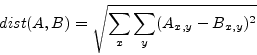
deviation vectors, then we define the spectral distance as
the mean and standard
deviation vectors, then we define the spectral distance as

This turned out to be a good measure for comparison.
2.4 Visualization
|
||||||||||||||||||||||||||||||||||||||||||||||||||||||||||||||||||||||||||||||||||||||||||||||||||||||||||||||||||||||||||||||||||||||||||||||||||||||||||||||||||||||||||||||||||||||||||||||||||||||||||||||||||||||||||||||||||||||||||||||||||||||||||||||||||||||||||||||||||||||||||||||||||||||||||||||||||||||||||||||||||||||||||||||||||
In BpmDj ever song is visualized using a specific color. Using equation
1 to reduce a FFT
frame, we still have 24
values
describing the sound color of a every song. These 24 dimensions cannot
be immediately used to define a color for a song. As such, we rely
on a PCA analysis and rearrange the 24 dimensional space to store
the most energy in the first three dimensions (implementing a
dimensionality
reduction). Those 3 dimensions determine then the red, green and blue
part of the song color. To avoid colors which are too dark every
dimension
is normalized after the PCA analysis and mapped to ![]() .
.
For readers unaware
of what a PCA analysis is we briefly summarize
it [3]. When given a matrix
![]() (
(![]() being the number of songs,
being the number of songs, ![]() being the number of frequency band),
a singular value decomposition will find matrices
being the number of frequency band),
a singular value decomposition will find matrices
![]() and
and
![]() such that
such that
and
![]() . In our
case a PCA analysis will calculate
. In our
case a PCA analysis will calculate ![]() and
and ![]() incrementally and
only keep
incrementally and
only keep ![]() . This is then
used to remap the original
. This is then
used to remap the original ![]() to
its
new orthogonal basis, being
to
its
new orthogonal basis, being ![]() .
.
 |
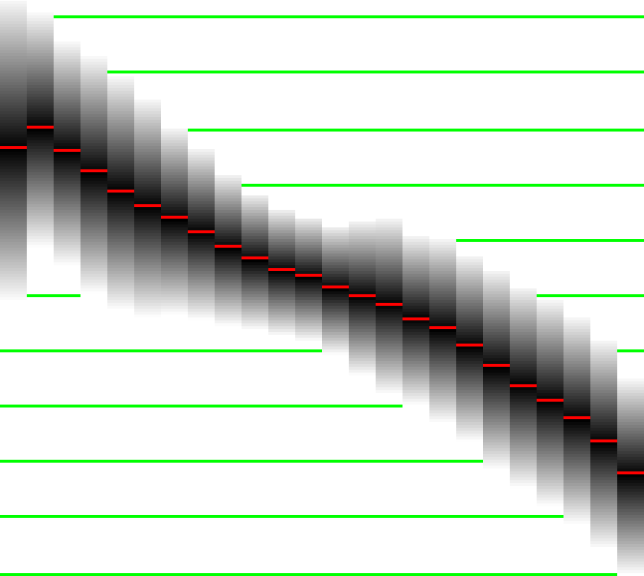
We performed the PCA analysis on our test set. The resulting primary vectors are given in table 5 and 7. Their strength is shown in figure 2. When using only the first three components we are able to capture 83.17%2 of the information content, which is very reasonable from a visualization point of view. A test on the unit vector reveals that the most important bands are bark band 12 (around 1600 Hz), bark band number 2 (around 150 Hz), and bark band number 7 (around 700 Hz).
The interpretation of this data should of course be considered carefully. One can assume that because we have a 'principal' component picking out these frequencies that those frequencies are 'important'. There is no good basis for this assumption. It might be exactly the opposite: because those frequencies doesn't matter that much, nobody really cares to tune them properly, hence they have the largest variability, and thus become a major component in the PCA analysis.
For the selected primary frequencies we might argue that they have the largest variation because standard mixing desks and audio engineers can tune them easily. Mixing desks typically offer a lo-, mid- and hi- frequency tuning, indeed targeting 150 Hz, 700 Hz and 1600 Hz. Furthermore, sound engineers wanting to modify the sound will target frequencies with the highest impact, hence the maximal spread over the bark scale.
Whether we can assume that variation equals importance is difficult to prove. When only interested in song visualization the PCA analysis will perform as wanted: songs sounding similar will automatically have a similar color.
2.5 Spectrum Clustering
 |
3 Energy accents
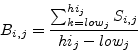
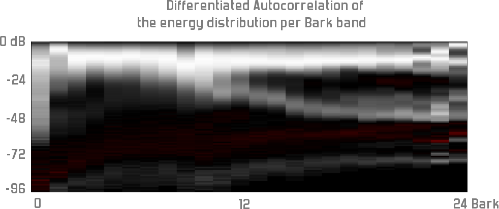
The echo characteristic of a song is a small image. On the abcis we plot a negative dB range (0 on the left, -96 on the right). On the ordinate we put the different bark bands. Bottom of the image is bark band 0, top of the image is bark band 23. (Figure 4 is rotated 90 degrees). The value of an image pixel relates to the number of times this frequency occurs in the song with that specific strength. One horizontal slice out of this image offers an histogram of the energy within the song (for that specific bark band).
3.1 Calculation
The 'echo' characteristic measures the distribution of the energy amplitude throughout the song. It is measured using a Sliding Window Fourier Transform which is normalized to the Bark Psychoacoustic scale. Every frame contributes to the creation of the image. Every frame (which normally consist of real and imaginary values) will be further be reduced to only the real part (Skipping the imaginary part of the Fourier transform implements a partial DCT transform, which has the nice property that it will compact energy [4]). The real value of a specific bark band then determines which bin's (dB) color value is increased. Once all those values are accumulated, we normalize the image.
Normalizing the image is done by autocorrelating and differentiating the 24 binned histograms. This highlights the relations between the different energy levels and removes sound color information.
Figure 4 shows the energy accent picture of the song 'Kittens - Underworld'. It presents 24 bark bands (0 being low, 24 being high frequencies). The first band shows how the bass tones are present at all kinds of energy-amplitudes. This is normal since this bin will also capture all residual energy that could not be captured by any other bin. Which also explains the previous encountered anomaly of the first bark band in the mean spectrum. The second bark band (band #1) show that the bass drum has very little accent. The higher the frequency the more structure we start to recognize. From band 12 and up we wee a split, indicating that the hi hats do have an accent. This can either be because they were programmed with a volume difference or because a delay is present. If you know the song, you will recognize this.
 |
3.2 Comparing Echo Characteristics
BpmDj will store the echo characteristic of a song in the meta
information
associated with that song. Due to space constraints every image is
reduced to ![]() pixels. The
dynamic range of the picture
is always reduced (or increased) to
pixels. The
dynamic range of the picture
is always reduced (or increased) to ![]() . Comparison of
the characteristic is done using the L2 norm. If
. Comparison of
the characteristic is done using the L2 norm. If ![]() and
and ![]() are
echo characteristics of two songs (
are
echo characteristics of two songs (
![]() ) then,
) then,
3.3 Understanding the echo characteristic
In order to understand the echo characteristic better, we relied on a song database each annotated with the echo characteristic as described. I tried to perform a PCA analysis on the energy accent maps, but it seemed that there was no convergence, probably due to accumulated round of errors. As such I fell back to an old technique I recently reinvented to analyze larger spaces: correlation analysis.
3.4 Structural Analysis
|


The correlation analysis process is based on the idea to correlate
some parameter with the stack of song images. In order to explain
the process I first need to explain how a single correlation analysis
works with respect to 1 external parameter. If we call the stack
of echo accent images ![]() and we have an external parameter
B associated with every image:
and we have an external parameter
B associated with every image: ![]() then we can correlate every
pixel in every image with the external parameter and obtain a new
one:
then we can correlate every
pixel in every image with the external parameter and obtain a new
one:
This image will show which areas correlate with the external parameter.
The trick we now use is to make the external parameter internal. By
choosing a position ![]() in the audio stack which has a) a high
variance, b) a large mean and is not covered by a previous analysis
we can assign that position to become B. So
in the audio stack which has a) a high
variance, b) a large mean and is not covered by a previous analysis
we can assign that position to become B. So
![]() . The
correlation then becomes
. The
correlation then becomes
If we perform this step once we color all positions that behave
similarly
to the originally chosen position ![]() . We then reiterate the
process for different positions. Figure 5
shows
different planes from the correlation analysis. Finally if we have
enough coverage of the entire stack we can stop and color the image
in pseudo-colors. Of course this resembles a coloring problem because
we want colors that are close to each other to have different colors
in order to distinguish them. In order to achieve this we performed
a PCA analysis to determine which 'color' belongs to which picture.
. We then reiterate the
process for different positions. Figure 5
shows
different planes from the correlation analysis. Finally if we have
enough coverage of the entire stack we can stop and color the image
in pseudo-colors. Of course this resembles a coloring problem because
we want colors that are close to each other to have different colors
in order to distinguish them. In order to achieve this we performed
a PCA analysis to determine which 'color' belongs to which picture.
Pseudo-Coloring of the superimposed behavioral planes
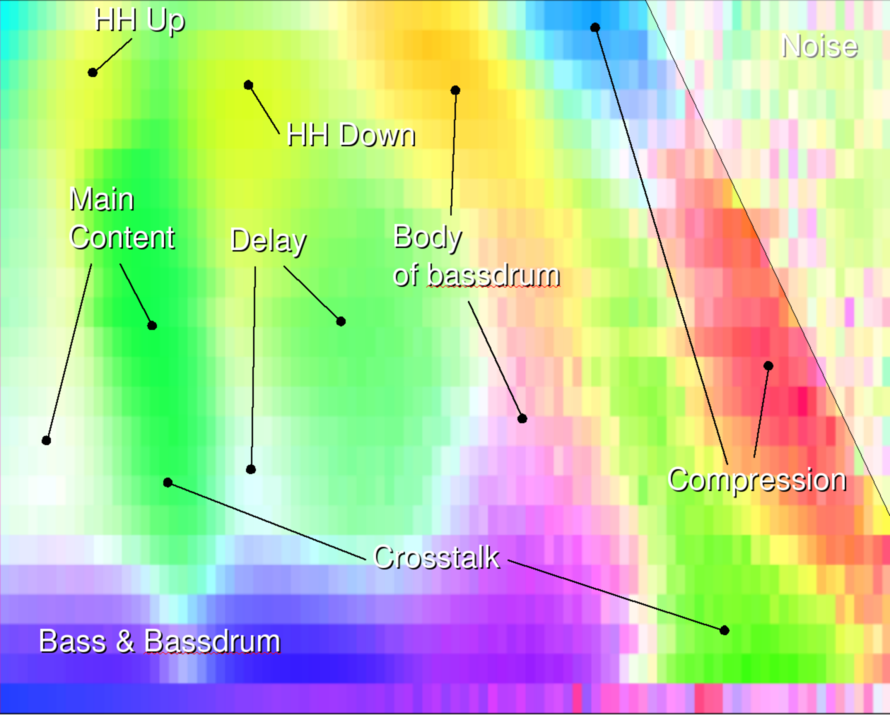
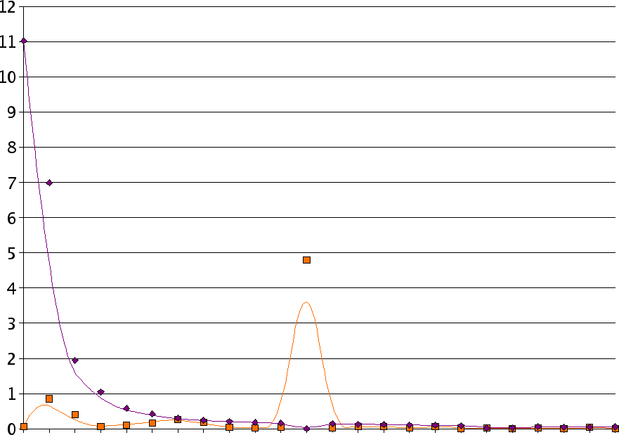
The coloring used to have a useful visualization is based on the performed PCA analysis. This analysis gives us the best projection of the different correlation images to have the maximum differentiation between them. This allows us to map the correlation stack onto a 2 dimensional plane. In this plane we search the central position and then measure the angle of every other projected correlation plane. Intuitively, if two correlation images are close to each other, (in the sense that they overlap a lot) then their angle will be close to each other. This information can be used in two ways.
In the first approach one could assume that we want to keep them close to each other and assign very similar colors to similar planes. This however would not accentuate the different areas that well. As such we need to have the maximum distance between the different correlation planes. In order to achieve this we will sort the correlation planes based on their angle and then use their index in the sorting, bit reverse it and used that as the hue of the color associated with a given correlation plane.
Discussion
The result of the correlation analysis are striking. Figure 6 shows the pseudo-colored overlay. We clearly wee how the lower frequencies (Bass & bass drum) run out into a less accentuated body. We also find that the body of the bass drum is below the signal strength of the real content. The real content has a variation at the left area (picture 5b,c,g,h,l,p). If one side correlates then the other anti-correlates. There can however be an accent seen in picture 5a,e,j,m). We also find a crosstalk back from the main content (green) to the lower frequencies. The blue and red sections are very likely due to compression, meaning that MP3/OGG compression will limit out those frequencies. Right of the compression are we find plain noise.
4 Conclusions
In this article we discussed how many interesting properties available in BpmDj are calculated. We presented an intriguing analysis of normal energy distributions in songs and we gave values for the 'perfect' spectrum based on an analysis of 16361 songs.
Acknowledgments
I would like to thank Kristel Joossens for pointing out the existence
of PCA analysis a couple of years ago. This information seed has grown
since then. I would also like to thank Sam Liddicot and Camille
d'Alméras
for financially supporting BpmDj through donations. Sourceforge.net
supports this work by offering web space and support facilities.
Bibliography
| 1. | The Bark and ERB bilinear transforms Julius O. Smith, Jonathan S. Abel IEEE Transactions on Speech and Audio Processing, December 1999 https://ccrma.stanford.edu/~jos/bbt/ |
| 2. | Psychoacoustics, Facts & Models E. Zwicker, H. Fastl Springer Verlag, 2nd Edition, Berlin 1999 |
| 3. | Matrix Computations Gene H. Golub, Charles Van Loan John Hopkins University Press, second edition edition, 1993 |
| 4. | Discrete-Time Signal Processing Alan V. Oppenheim, Ronald W. Schafer, John R. Buck Signal Processing Series. Prentice Hall, 1989 |
Footnotes
- ...1 This 'perfect' is in analogy with the 'perfect' face which is composed of the mean distances of many different human faces.
- ...2 The values plotted in figure 2 are relative to the number of dimensions. Hence, the sum of the energy captured by the 3 first vectors is 19.9608. Divided by 24 gives 83.17 %
| http://werner.yellowcouch.org/ werner@yellowcouch.org |  |